Neco
Brand Identity & Packaging
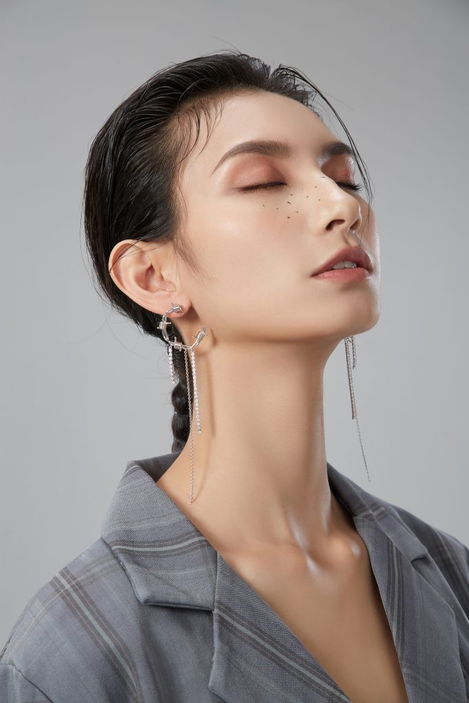
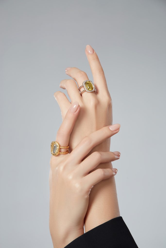
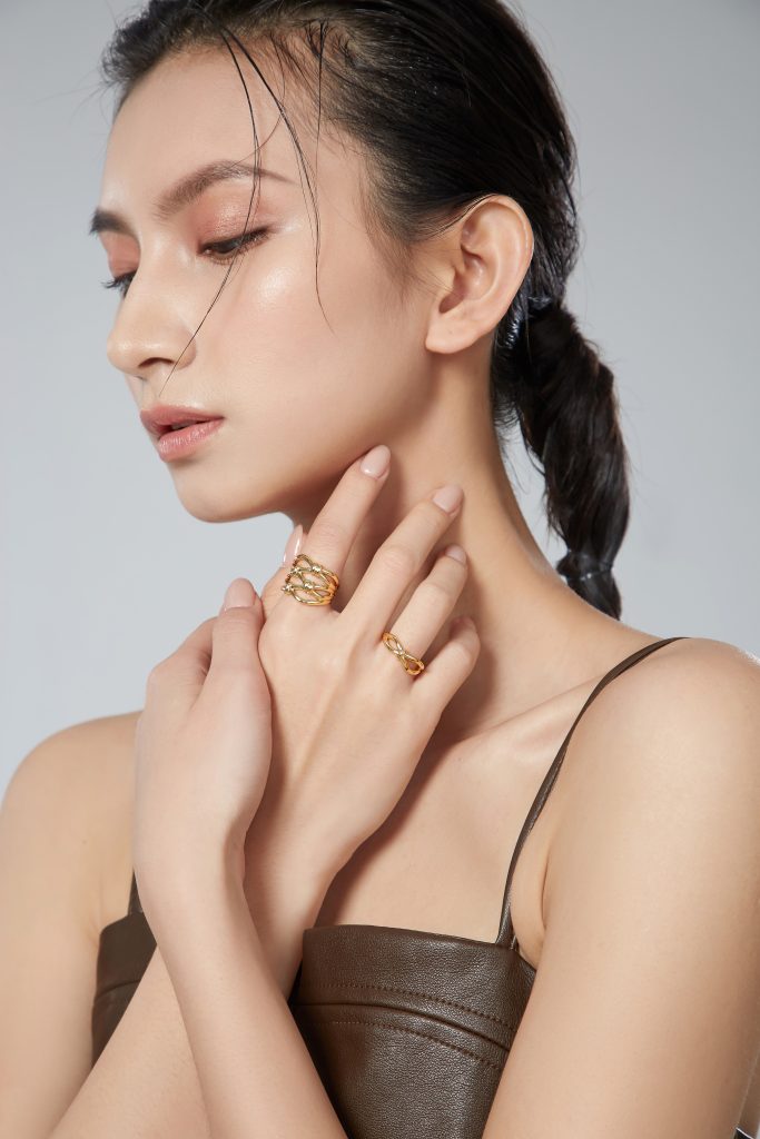
Neco专注于珠宝首饰领域,推崇无拘无束的设计思维,大胆进行试验性探索,将传统珠宝与现代艺术巧妙融合。它把日常用品以时尚首饰的形式精彩呈现,以巧妙且幽默的设计常伴人们左右。
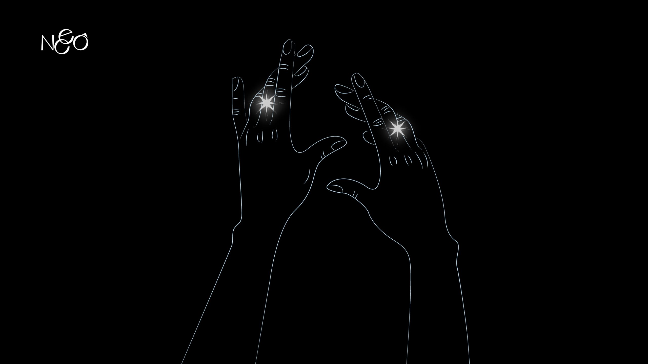
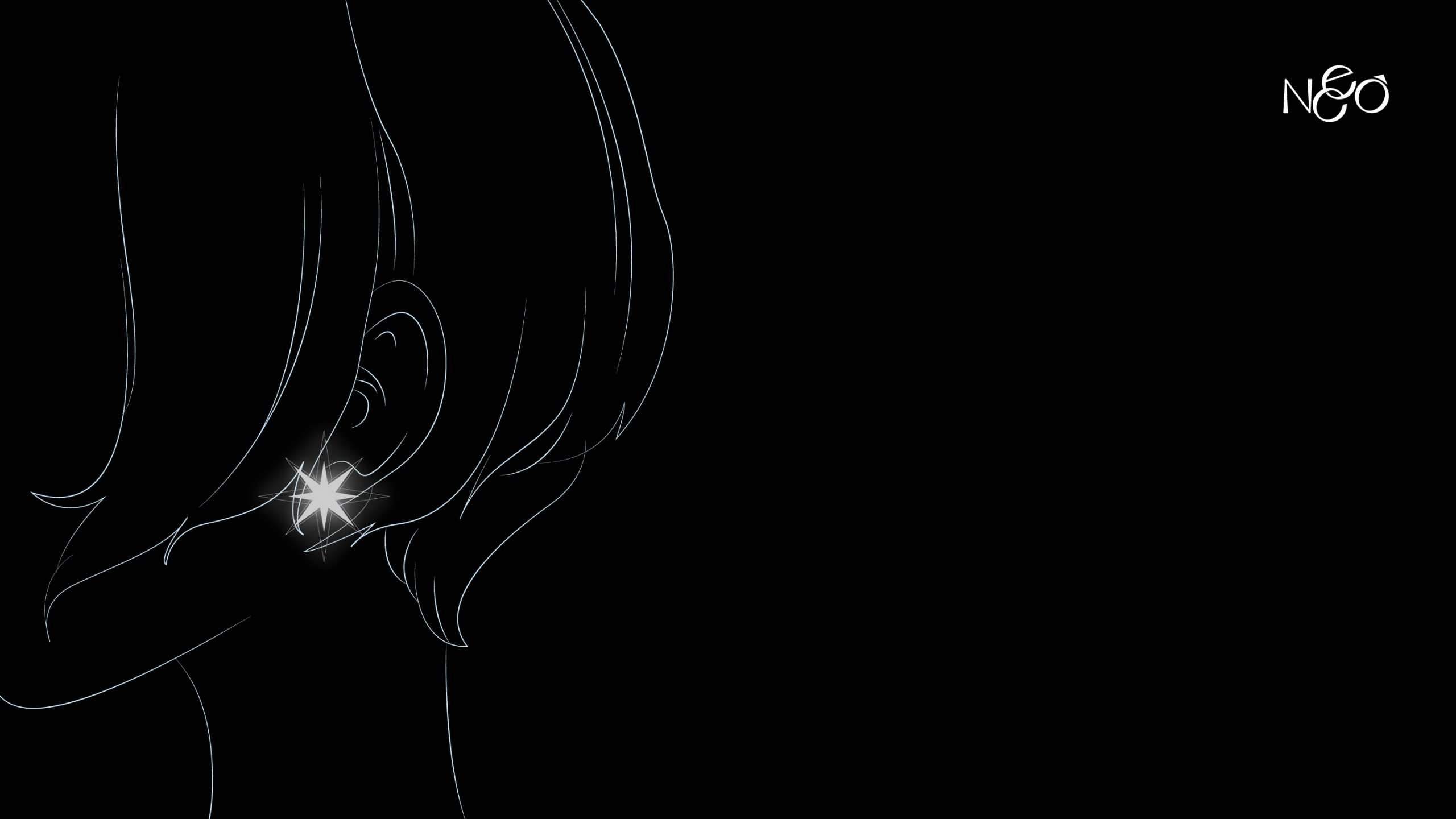
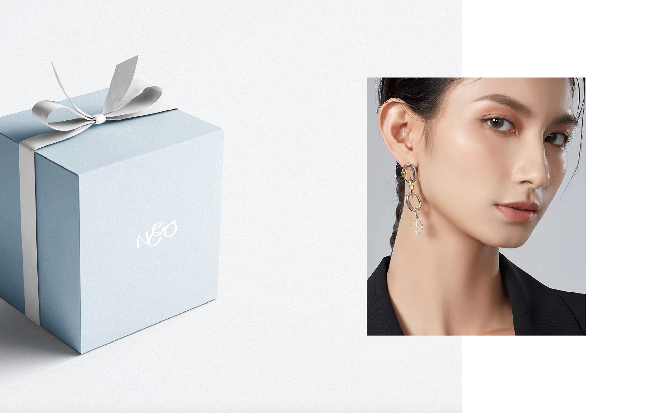
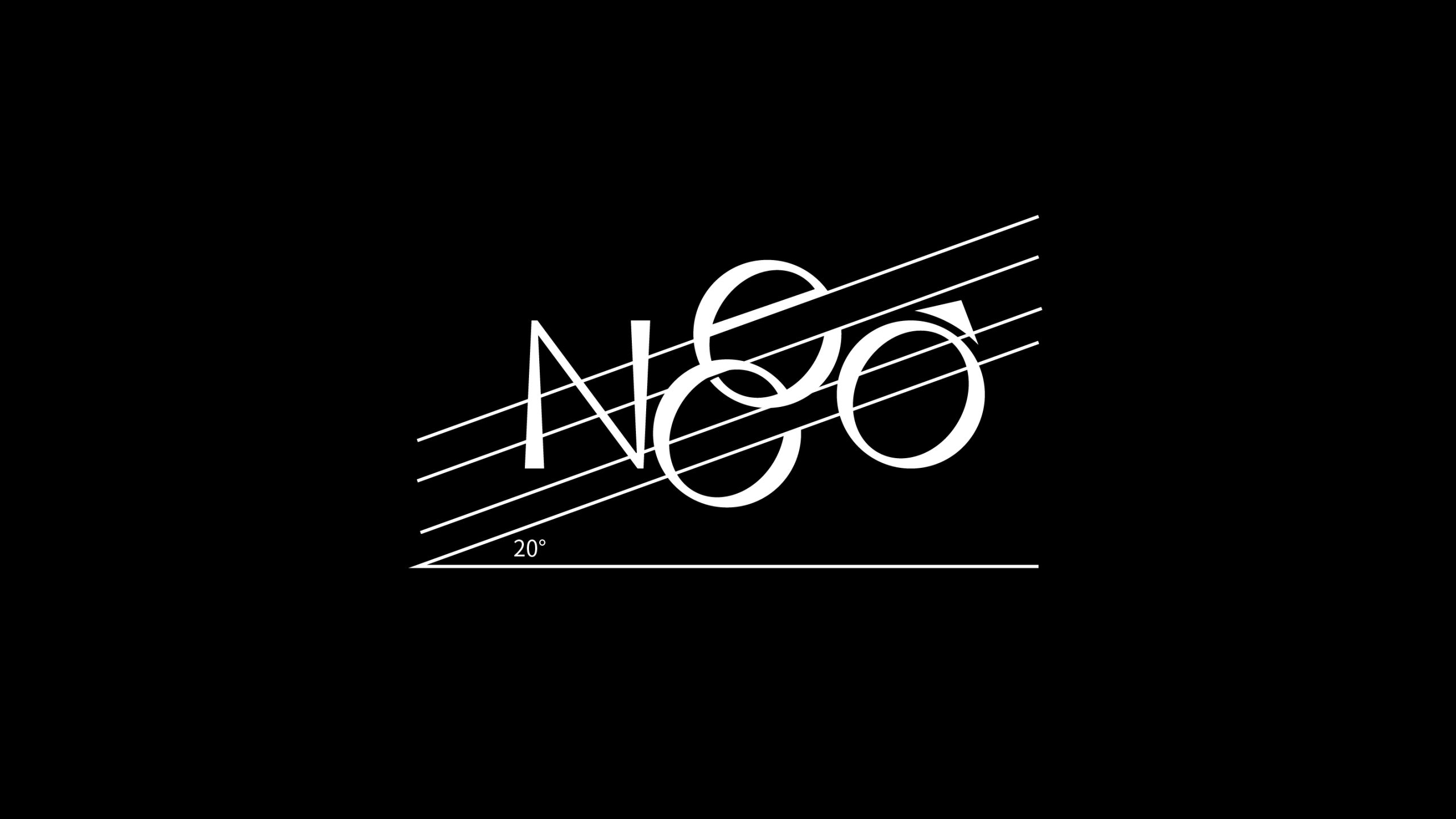
我们携手 Neco,共同打造全新品牌形象。将珠宝的卓越质感与艺术的非凡创造力精妙融合,为首饰与用户之间增添璀璨的连接纽带。标志的字母设计呈 20 度仰角,既象征着新时代女性向上的强大力量与迷人魅力,又传达出一种积极进取的生活态度。清晰明确的品牌主张,使其能够更有效地与用户构建起价值共鸣。
Neco focuses on the field of jewelry. Its brand design perfectly combines the excellent texture of jewelry with the extraordinary creativity of art. This brand advocates an unrestrained design concept, boldly conducts experimental exploration, and cleverly combines traditional jewelry with modern art. It presents daily necessities in the form of fashionable jewelry and accompanies people with ingenious and humorous designs.
We join hands with Neco to jointly create a new brand image. Exquisitely integrating the excellent texture of jewelry and the extraordinary creativity of art adds a brilliant connection between jewelry and users. The letter design of the logo is at a 20-degree elevation angle, which not only symbolizes the strong power and charming charm of women in the new era looking upward, but also conveys a positive and enterprising attitude towards life. A clear and definite brand proposition enables it to build value resonance with users more effectively.
